How to Make a Relative Frequency Table in Excel
When you want to make an overview of data, a clever choice is to set up a frequency table in a spreadsheet. Now we’ll learn how this is done.
Excel Instruction
Making a Relative Frequency Table
- 1.
- Make the “skeleton” of the table. You’ll need columns for frequency and relative frequency in addition to a column with the different categories of data. Input the frequencies of all the categories.
- 2.
- Find the sum of all the frequencies.
- 3.
- Calculate the relative frequency of all the categories.
- 4.
- (Optional) Change from decimal numbers to percentages in the relative frequency column.
Example 1
Relative Frequency Table
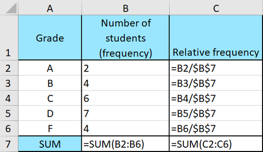
Below you can see a frequency table of the grade distribution within a school class.

Make a relative frequency table of the grade distribution.
From the table you can see that there’s six students who got a C. Relative frequency means that you are interested in finding the share of students in the whole class that got a given grade.
This is how you proceed:
- 1.
- Set up the table in
Excel. In addition to the original frequency table, you’ll need a column for relative frequency as well. Enter the frequency in the frequency column. - 2.
- Find the sum of all students. Use the command:
=SUM(B2:B6)
- 3.
- Now you’re ready to find the relative frequencies of the different categories. Remember that
Therefore, the formula in cell
C2is=B2/$B$7
Note! Remember that $-signs are used to prevent Excel from shifting the cell references when you copy formulas. The $ denotes an absolute cell reference.
Highlight cell
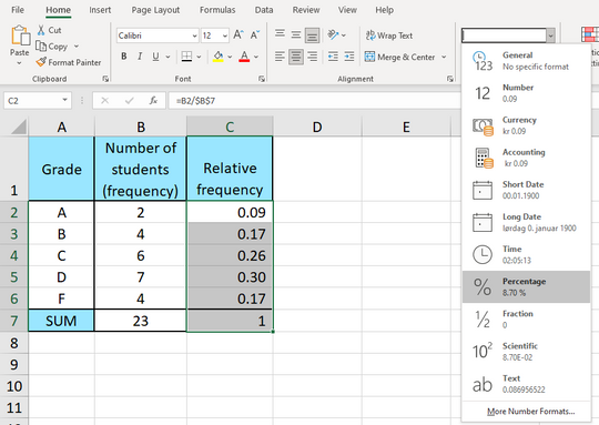
C2and copy the formula down toC6. The final result should look like this:With formulas:
- 4.
- (Optional) Notice that the numbers in the relative frequency column are decimal numbers between 0 and 1. If you prefer percentages instead, you can highlight the numbers in the column and choose
Percentfrom the menu in the picture shown below:Then the table will look like this: